📊 Key Diagrams
Core macroeconomics diagrams for quick reference and revision
1. Production Possibilities Frontier (PPF)
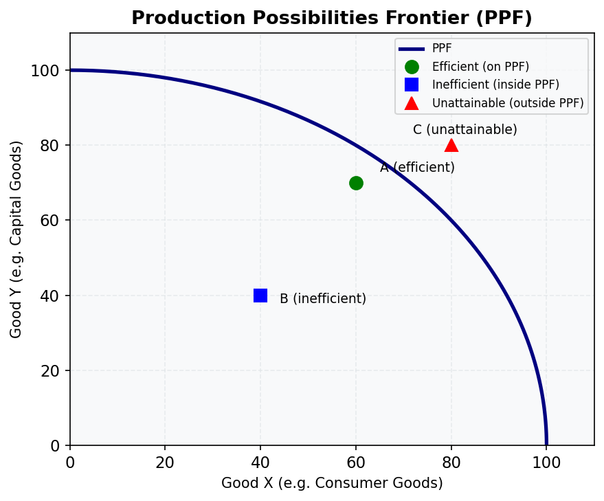
The PPF shows the maximum combinations of two goods an economy can produce given its resources and technology.
- On the curve — efficient (all resources fully employed)
- Inside the curve — inefficient (idle resources or poor technology)
- Outside the curve — currently unattainable
- The slope measures the opportunity cost of producing one more unit of Good X
Relevant lessons: M01, M03
2. Keynesian Cross
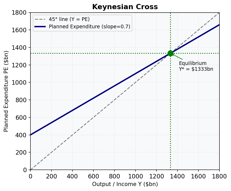
Equilibrium output Y* is where planned expenditure (PE) crosses the 45° line (PE = Y).
- Slope of PE line = MPC − import propensity (b − m)
- Multiplier = 1/(1 − b + m)
- Gaps above/below equilibrium cause inventory adjustment until Y* is reached
Relevant lessons: M04, M13
3. Money Market Model
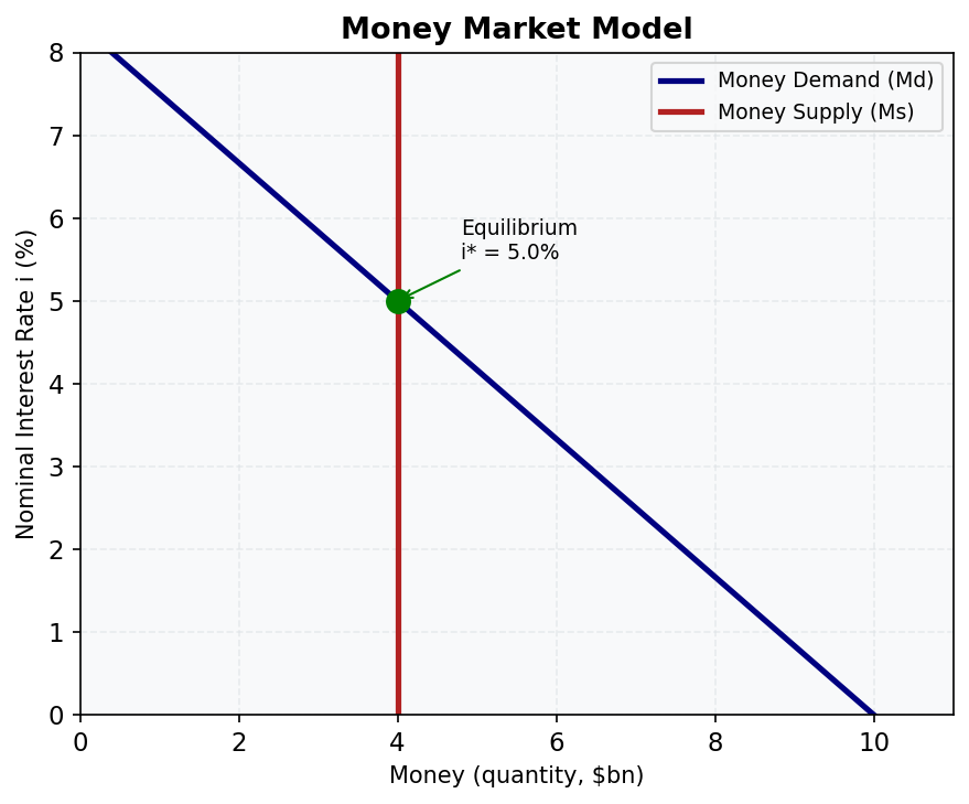
The equilibrium interest rate is set where money demand (downward sloping) meets money supply (vertical — controlled by the RBA).
- RBA increases Ms → curve shifts right → interest rate falls
- Income rises → Md shifts right → interest rate rises
Relevant lessons: M05, M06, M14
4. Aggregate Demand – Aggregate Supply (AD-AS)
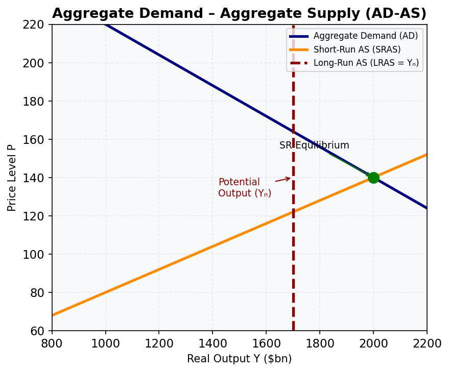
The AD-AS model determines the price level and output in the short and long run.
- AD slopes down (wealth effect, interest rate effect, exchange rate effect)
- SRAS slopes up (sticky wages and prices in the short run)
- LRAS is vertical at potential output Y_n
- Long-run equilibrium requires AD = SRAS = LRAS
Relevant lessons: M07
5. IS-LM Model
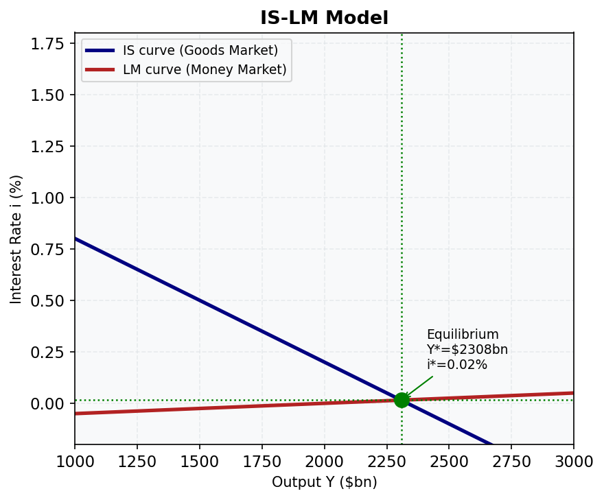
Simultaneous equilibrium in goods markets (IS) and money markets (LM).
- IS slopes down: higher i → lower I → lower Y
- LM slopes up: higher Y → higher money demand → higher i
- Australia calibration: Y* ≈ $2,308bn, i* ≈ 1.54% (post-GFC baseline)
- Fiscal expansion → IS shifts right (with crowding out)
- Monetary expansion → LM shifts right
Relevant lessons: M14, M15
6. Phillips Curve (Short-Run and Long-Run)
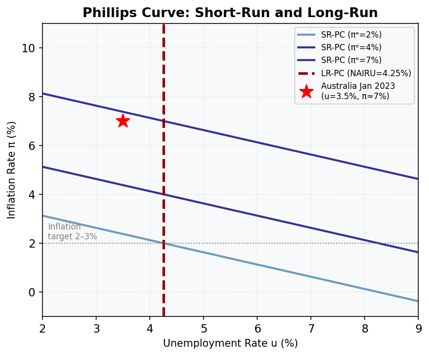
The trade-off between inflation and unemployment.
- Short-run PC slopes down: lower u → higher π (at given expectations)
- Long-run PC is vertical at the NAIRU (~4.25% for Australia)
- SR-PC shifts up when inflation expectations rise (or supply shocks hit)
- Australia Jan 2023: u = 3.5% (below NAIRU), π ≈ 7% (well above target)
Relevant lessons: M16, M17
7. Solow Growth Model
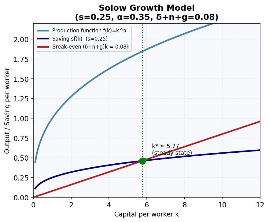
The steady-state capital stock k* is where saving per worker equals break-even investment.
- sf(k): saving per worker (concave — diminishing returns)
- (δ+n+g)k: break-even investment (replacement + new workers + technology)
- Australia: s = 0.25, α = 0.35, δ+n+g = 0.08 → k* ≈ 5.77, y* ≈ 1.85
- Golden rule: s_GR = α = 0.35 → Australia saves too little (s = 0.25 < 0.35)
Relevant lessons: M18
8. Mundell-Fleming Model
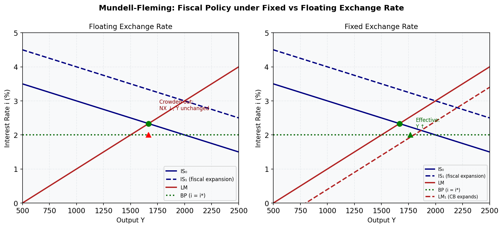
Policy effectiveness in an open economy depends on the exchange rate regime.
| Floating | Fixed | |
|---|---|---|
| Fiscal policy | Ineffective (crowded out via AUD appreciation) | Effective |
| Monetary policy | Effective | Ineffective |
- Australia (floating + free capital): monetary policy works; fiscal policy has limited multiplier
- The impossible trilemma: cannot simultaneously have free capital mobility, fixed exchange rate, and independent monetary policy
Relevant lessons: M20, M21